
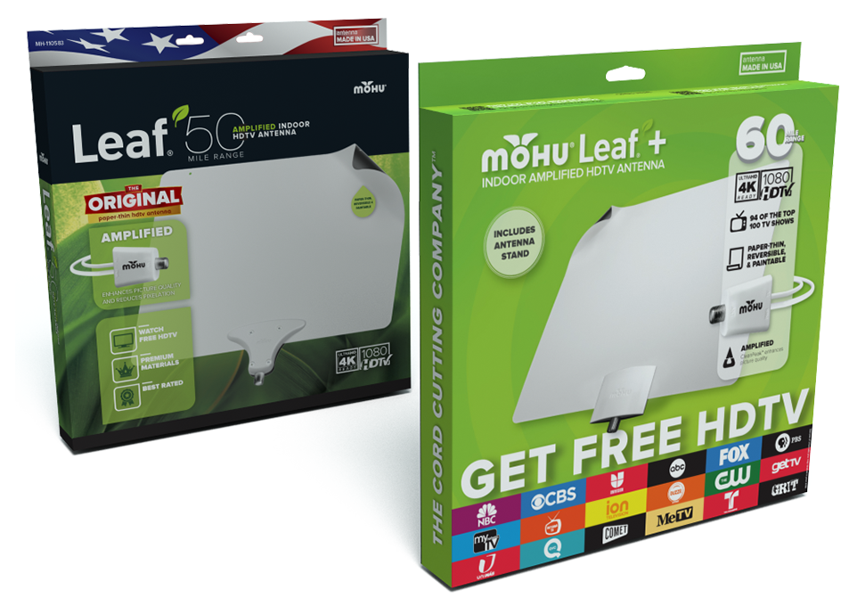

Mohu decided that a refresh was needed to revitalize retail sales and accommodate a large new line of products. We didn’t want to lose the distinctive bright green that set our products apart visually on the shelf from the competitors’ mostly grays and blacks.
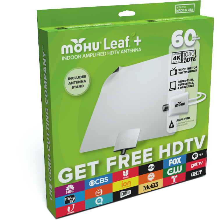
I also wanted to incorporate the concept of the icon cluster common with streaming devices to describe the services available, but translate them into over-the-air channels in a bright and eye-catching way.
I updated the bold green on the packages to include a subtle gradient, referencing the former organic photographs in the background. The background also includes a low-contrast radio-wave pattern to reinforce the nature of antennas.
The packages still include large call-outs for features and especially the antenna mileage reach. The mileage is called out in chunky 3D text, which is trending currently.
The finishing touch is a spot UV coat that really catches the light and focuses both on the product and the callouts.
I redesigned over 30 packages (not all pictured here) and continue to adapt the theme to new products being launched monthly. I frequently render photorealistic images of products from CAD files for packaging before it physically exists to meet production deadlines.
I am also familiar and confident working with large domestic offset press companies, offshore printers, and very large orders (often on short notice).